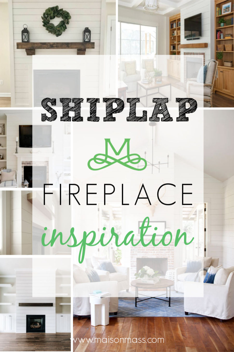
In my job I see a lot of fantastic new construction homes and one trend that I’ve been eyeing is the shiplap fireplace. It comes in a lot of flavors: with a traditional mantel or with just a mantel shelf, full height shiplap or only on top, and so on. So, after seeing a fireplace in a model home that I just loved, my mind started to envision what this might look like in my house – so I searched for some additional shiplap fireplace inspiration to prepare for the redo.

If you are familiar with the blog, you know that I have a traditional, New England colonial style house, and I wasn’t sure if a shiplap fireplace would work in my family room, but I decided to go for it. Below is a shot of my fireplace today. Nothing to complain about, but it was starting to feel like it needed to be brought into the 21st century.

Not content with just the one example, I did some online research and found some other shiplap fireplace inspiration for my remodel – each with different aspects that I liked.

I love the clean look of this fireplace and am especially digging the chunky, natural wood mantel shelf. My fireplace also bumps out like this one, so its good to see an example of something that comes off of the wall and needs to be finished on three sides. One thing I’m not sure about in this example is the framing of the shiplap with 1X stock along the edges.

This picture is similar to the last (do you see a pattern here? :)) in that the fireplace juts out off the wall and the fact that it also uses molding to frame in the shiplap. This one shows some exposed traditional brick along the black firebox which is similar to what I will end up with as well.

Here’s a great example of an alternate way to finish the edge of the shiplap – mitering the corners at 45 degrees and joining them to produce the edge. This is the method I am leaning towards and am crossing my fingers my hubby can make that magic happen in our family room :).

I pinned this one because I like the overall aesthetic. It has the mitered edges I like and the wood beam. This is also the stain color I will probably go with because I already have two beams that run along the ceiling in my family room that are stained dark. This inspiration photo also shows the fireplace finished with crown moulding at the top – something I currently don’t have in my family room, but may consider.

I added this to my board because of its brick treatment. I too have a brick surround and hearth and I like the way they painted the brick in the surround to blend in with the rest of the vertical face of the fireplace but left the hearth a traditional red. I don’t want to lose all of the brick in my space, but I like the monochrome look of the vertical plane.

To round it out, I found this fireplace which has several elements of interest. First, there’s a lot of brick – but it looks like it has a light whitewash to mute the reds a bit, and I’m digging it. Next, it has the coveted mitered corners I am looking for. And finally, my fireplace is also flanked by a window on each side and this pic is making me contemplate shiplapping (spell check is telling me this isn’t a verb, but I think it should be :)) the whole wall and not just the fireplace.
What do you think? Let me know your thoughts in the comments!
Check out the next post in the shiplap fireplace series!


